


The presence of data in the modern business world is undeniable, with facts, figures, and data-driven strategies being at every turn. By utilizing data, be it internal or industry-wide, companies can examine trends, understand their customers on a deeper level, and create a framework for future success.
While data analysis is a skill in itself, what is done with that data is equally as important. Without strong data visualization skills, the central meaning and results of analysis can be missed, misunderstood, or simply glossed over. Considering that human brains can process images 60,000 times faster than with text alone, the benefits of effective data visualization cannot be understated.
In this article, we’ll be exploring four central tips that can boost the quality of your data visualization strategy. To avoid giving off the wrong message or presenting your meticulously analyzed data in the wrong light, start incorporating these ideas when you build infographics, graphs, and other visual displays of the data you’ve collected.
We’ll cover:
- Knowing your audience
- Choosing the correct data visualization structure
- Labels, Labels, Labels
- Making good design decisions
Let’s get right into it.
Table of Contents
Know Your Audience
Data analysis is not done on a whim, it’s almost always serving a specific purpose or looking for trends or further information. Due to this, it’s always a good idea to have a central question in mind when creating a data visualization. One of the easiest ways of generating the question is by thinking about who you’re going to be presenting this data to.
If you’re presenting to a room of sales employees that are looking for a specific take away from your analysis, then be sure to make what they’re looking for a more prominent part of your chart or depiction. Think about who will be in the room when you present, and what they’ll want from your analysis.
When constructing a graph, if you have lots of superfluous information that your audience won’t be interested in, then the graph will become cluttered, and its effectiveness is reduced.
Before creating visual elements to display your data, make sure that you’ve outlined the key bits of information that the people you’re showing it to want to know. From there, be sure to place them as a central priority within your work, helping to guide people’s eyes towards the most vital information.
Knowing your audience is always the very first step towards creating data that effectively conveys the exact information that it needs to.
Choose the Correct Visualization Structure
One of the most overwhelming elements of constructing data visually is the sheer quantity of different options that are available. In order to effectively convey your data, you’re going to want to select a visualization structure that helps demonstrate the central trends, ideas, and findings of your analysis visually.
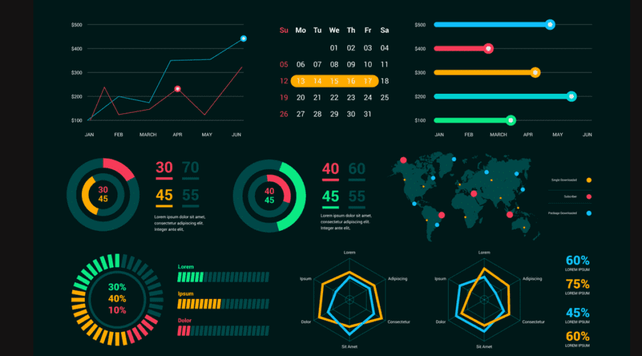
Here are the five most common methods of presenting data, and what they’re good for:
- Bar Graphs – By far one of the most popular visualization techniques, bar charts are wonderful for displaying nominal categories and making comparisons between them.
- Scatter Graphs – When plotting the relationship between two variables, scatter plots are one of the most popular graph styles, helping to realize the underlying correlation between data sets.
- Line Graphs – If you’re displaying data that has changed over time, then line graphs will most likely be your go-to solution.
- Pie Charts – Love them or hate them, pie charts are still vastly popular. They are good at showing proportionality, making them good for composition data visualization.
- Histograms – For continuous and often larger data sets, histograms are a great way of communicating the distribution of a dataset visually.
You may be thinking that with the number of choices there are, choosing the correct structure is much easier said than done. While that may be true, it’s always useful to go back to the initial question of what exactly you want to show with this graph.
Let’s break this down by commenting on different intentions:
- Showing Relationships – When exploring the relationship between two data sets, the best graphs are scatter graphs and bubble charts, as these provide easy visualization of similarities and differences.
- Showing Composition – If you’re trying to show the relative composition of different features, then stacked graphs are typically the most common option. Whether it be a stacked area chart or a stacked column chart, the intent is always about showing what a certain dataset is made up of, meaning stacked is the way to go!
- Showing Distribution – Histograms are by far the most common method of showing the distribution of many different data points, with the balance between line and column histograms depending on the number of points you have to convey. That said, scatter charts can also be a great way of showing general distribution patterns visually.
- Comparing – The vast majority of the time, you’ll be comparing two or more items within your data visualizations. With this intent, you have a vast range of appropriate graphs, with the best being bar charts and line charts. Remember – simple is often best when it comes to data visualization.
Always go back to your intentions, then select a graph type, then display the most prominent data on it. Keep things simple and to the point, choosing the graph structure that seems most natural for whichever purpose you’ve compiled the data analysis.
Label Everything
If you’re a data engineer that’s used to working with your cloud data storage warehouse, then you’ll be able to recognize what a graph is displaying without much additional guidance. Equally, you may be completely fine in understanding a trend by just looking at a large data set or spreadsheet. The same does not necessarily go for your audience.
You cannot expect your audience to make logical jumps, no matter how obvious they may seem to you, after spending time assembling the graphs. Due to this, you should always be sure to label absolutely everything that you can. Moving through a simple checklist, remember to include a label for:
- The Axes
- Graph title
- Legend (if needed)
- Individual assets
By making sure everything is labeled, the people you’re presenting to will have an easier time drawing meaning from your work and landing at the conclusions you want them to.
Another tip is to ensure that your cloud data warehouse is set up to allow for easy visualization down the line. When choosing a cloud data warehouse to use, be sure to check out their differences when it comes to supporting different types of data visualization. By looking into distinct features of major warehouses like Clickhouse vs BigQuery, you’ll be able to get a better insight into how data visualization works on those platforms, making the transition between a spreadsheet and your compiled graph much easier.
Design Choices
Much like how labels can make your graphs much easier to understand, designing with people in mind can have the same effect. We can split the fundamentals of design into three areas, which we’ll move through and give some general tips.
- Fonts – When selecting the fonts you’ll be using within your graphs and labels, be sure to stick to easy-to-read fonts. These are typically fonts that you would have heard of, like Helvetica and Georgia. Naturally, something that’s easier to read (especially from a distance) will go down better when you’re presenting to a room of people.
- Text – Keep text and explanation to a minimum if you can. Only include vital labels and infer meaning. If further explanation is needed, don’t cram it into a text box on top of your graph. Instead, create a short description box under the graph, or simply explain the graph to the room when you’re presenting it.
- Color – Naturally, we have a range of color associations that are built up throughout our lives. When creating a graph, try to stick to those associations to infer meaning through color. For example, lighter shades are typically associated with low-intensity, while bold shades are connected with high-intensity. Equally, red is known as hot, while blue is known as cold. Considering that 90% of information transmitted is visual, it’s always a good idea to rely on the preconceived understanding that color can suggest.
By sticking to these three fundamental pillars of design, you’ll be equipped with everything you need to make a graphic that accurately and instantly conveys the results and trends behind your data.
Final Thoughts
Data visualization is as much of a skill as data analysis itself. Without the ability to present findings in an easy-to-understand way, then the whole point of analysis is lost. Be sure to always incorporate design methodology into your visual structures, selecting the most straightforward method and focusing on the most important data available.
Above all else, keep things simple and straight to the point – your audience will thank you, and your data will always come across as clearly as possible.